

In Praise of Prokudin-Gorskii
by Ctein
 In
my always-humble opinion, Sergei Mikhailovich Prokudin-Gorskii
(1863-1944) was the first master of modern color photography. There are
many web sites devoted to his work; these two are good places to start:
In
my always-humble opinion, Sergei Mikhailovich Prokudin-Gorskii
(1863-1944) was the first master of modern color photography. There are
many web sites devoted to his work; these two are good places to start:
http://www.gridenko.com/pg/
http://www.loc.gov/exhibits/empire/
He is an offshoot from the main track, largely as a result of having worked in Czarist Russia and then getting pretty well lost in the post-WWI reshuffling of Eurasia. But I consider him a major figure in photography; I'm a very big fan of his work.
 I'm
not talking about his technical achievements, although they were
monumental. What makes him stand out is that he was a genuine artist,
not just a craftsperson. Color in photography wasn't taken seriously for
a very long time. It's not just all the early experimenters; you can
see the "Oh, wow, it's got color"
aesthetic (or unaesthetic) operating well into the middle of the 20th
century in way, way too much of the body of photography. Even in the
classic National Geographic
dictum of many years ago: "stick someone in a bright red shirt in an
otherwise-dull landscape to catch the reader's eye." That's not color as
art, that's color simply for the sake of an exclamation point. Color
was usually tacked onto a B&W; aesthetic rather than being treated
as an integral part of the aesthetic. Prokudin-Gorskii took the medium
of color photography and ran way ahead of this time. He got beyond the
gee-whiz factor of "Looky, mom, I'm recording color!" Instead, he did
some seriously good art.
I'm
not talking about his technical achievements, although they were
monumental. What makes him stand out is that he was a genuine artist,
not just a craftsperson. Color in photography wasn't taken seriously for
a very long time. It's not just all the early experimenters; you can
see the "Oh, wow, it's got color"
aesthetic (or unaesthetic) operating well into the middle of the 20th
century in way, way too much of the body of photography. Even in the
classic National Geographic
dictum of many years ago: "stick someone in a bright red shirt in an
otherwise-dull landscape to catch the reader's eye." That's not color as
art, that's color simply for the sake of an exclamation point. Color
was usually tacked onto a B&W; aesthetic rather than being treated
as an integral part of the aesthetic. Prokudin-Gorskii took the medium
of color photography and ran way ahead of this time. He got beyond the
gee-whiz factor of "Looky, mom, I'm recording color!" Instead, he did
some seriously good art.
 His
work has surprisingly modern sensibilities. Prokudin-Gorskii understood
the subtle interplay of luminosity and chroma that make up the totality
of visual experience. He didn't see color and tone as disconnected
elements but as part of an integrated whole. It reminds me a lot of the
B&W; WPA work of the late 1930s or even the post-WWII work of the
'50s but with a more pastoral feel about it. Kind of Hudson River School
meets Walker Evans.
His
work has surprisingly modern sensibilities. Prokudin-Gorskii understood
the subtle interplay of luminosity and chroma that make up the totality
of visual experience. He didn't see color and tone as disconnected
elements but as part of an integrated whole. It reminds me a lot of the
B&W; WPA work of the late 1930s or even the post-WWII work of the
'50s but with a more pastoral feel about it. Kind of Hudson River School
meets Walker Evans.
 Looking
at his restored work, you'd never imagine he was working with such a
difficult means of making photographs. You see the art; you don't notice
the technique—one hallmark of really good work.
Looking
at his restored work, you'd never imagine he was working with such a
difficult means of making photographs. You see the art; you don't notice
the technique—one hallmark of really good work.
 In
my always-humble opinion, Sergei Mikhailovich Prokudin-Gorskii
(1863-1944) was the first master of modern color photography. There are
many web sites devoted to his work; these two are good places to start:
In
my always-humble opinion, Sergei Mikhailovich Prokudin-Gorskii
(1863-1944) was the first master of modern color photography. There are
many web sites devoted to his work; these two are good places to start:http://www.gridenko.com/pg/
http://www.loc.gov/exhibits/empire/
He is an offshoot from the main track, largely as a result of having worked in Czarist Russia and then getting pretty well lost in the post-WWI reshuffling of Eurasia. But I consider him a major figure in photography; I'm a very big fan of his work.
 I'm
not talking about his technical achievements, although they were
monumental. What makes him stand out is that he was a genuine artist,
not just a craftsperson. Color in photography wasn't taken seriously for
a very long time. It's not just all the early experimenters; you can
see the "Oh, wow, it's got color"
aesthetic (or unaesthetic) operating well into the middle of the 20th
century in way, way too much of the body of photography. Even in the
classic National Geographic
dictum of many years ago: "stick someone in a bright red shirt in an
otherwise-dull landscape to catch the reader's eye." That's not color as
art, that's color simply for the sake of an exclamation point. Color
was usually tacked onto a B&W; aesthetic rather than being treated
as an integral part of the aesthetic. Prokudin-Gorskii took the medium
of color photography and ran way ahead of this time. He got beyond the
gee-whiz factor of "Looky, mom, I'm recording color!" Instead, he did
some seriously good art.
I'm
not talking about his technical achievements, although they were
monumental. What makes him stand out is that he was a genuine artist,
not just a craftsperson. Color in photography wasn't taken seriously for
a very long time. It's not just all the early experimenters; you can
see the "Oh, wow, it's got color"
aesthetic (or unaesthetic) operating well into the middle of the 20th
century in way, way too much of the body of photography. Even in the
classic National Geographic
dictum of many years ago: "stick someone in a bright red shirt in an
otherwise-dull landscape to catch the reader's eye." That's not color as
art, that's color simply for the sake of an exclamation point. Color
was usually tacked onto a B&W; aesthetic rather than being treated
as an integral part of the aesthetic. Prokudin-Gorskii took the medium
of color photography and ran way ahead of this time. He got beyond the
gee-whiz factor of "Looky, mom, I'm recording color!" Instead, he did
some seriously good art.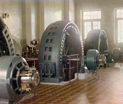 His
work has surprisingly modern sensibilities. Prokudin-Gorskii understood
the subtle interplay of luminosity and chroma that make up the totality
of visual experience. He didn't see color and tone as disconnected
elements but as part of an integrated whole. It reminds me a lot of the
B&W; WPA work of the late 1930s or even the post-WWII work of the
'50s but with a more pastoral feel about it. Kind of Hudson River School
meets Walker Evans.
His
work has surprisingly modern sensibilities. Prokudin-Gorskii understood
the subtle interplay of luminosity and chroma that make up the totality
of visual experience. He didn't see color and tone as disconnected
elements but as part of an integrated whole. It reminds me a lot of the
B&W; WPA work of the late 1930s or even the post-WWII work of the
'50s but with a more pastoral feel about it. Kind of Hudson River School
meets Walker Evans.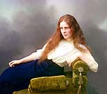 Looking
at his restored work, you'd never imagine he was working with such a
difficult means of making photographs. You see the art; you don't notice
the technique—one hallmark of really good work.
Looking
at his restored work, you'd never imagine he was working with such a
difficult means of making photographs. You see the art; you don't notice
the technique—one hallmark of really good work.Posted by: CTEIN
16 Comments:
Iwonder if he will also be given credit for inventing purple fringing. See 00791.
Tony Collins
I am currently going through the Jeff Curto's History Class podcast and waiting when he mentions Pokudin-Gorskii. Not yet but I still hope.
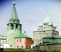
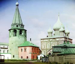
Definitely Pokudin-Gorskii has to be one of the major figures when studying photography. Not only as color artist but his compositions are extraordinary and the subjects are examples of selection worth viewers attention.
Highly recommended! (as they say in some photo-communities) ;-)
So cool.
Ctein,
astonishing!!!!
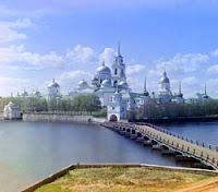
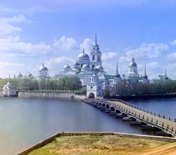
Not only for the impressive color, but for the images of a vanished world, with no cars, little people, no tall buildings, all captured with a high sense of aesthetics.
Hélcio
Wow, fascinating stuff. I understand that he had a "magic lantern" device to project his black and white negatives as color images, using red, green and blue filters. I wonder whether he had any technology to actually print his work in color at that time (1905-1915).
Isn't the Library of Congress an incredible resource? Who would think that they would purchase Czarist color photographs of this range and quality? And see to it that they are restored. Thanks for bring this work to our attention. I don't know why I didn't hear of it earlier.
I liked the Bukharan minister of the Interior best. From his closed eyes, I suspect that exposure times approached a minute.
scott
This is exquisite work. I particularly like the portraiture. Like many people I have family snap shots from 1870s onwards in sepia tonned black and white. But to see colour work from the 1900s is absolutely amazing.
I have been experiment with tri-colour printing with the gum-bichromate process with some success. And to see these is really encouraging and inspiring.
I particularly like the subtlety of the colours in an age of hyper-saturated digital colour. I think the palette is so beautiful.
As to the subject matter I have a really soft spot for Russia having spent some time there in the 1980's. Fantastic to see some of the architecture as it was before the ravages of the Soviet regime took their toll. I certainly would like to see more Russian photographic work. I am familiar with the work of Alexander Rodchenko and Boris Mikailov, but that is all. So its great to see some more, especially pre-Soviet work.
Funny, I also liked the Bukhara Emir and have spent the last hour doing my own repro.
Don't be misled by the big words like "digichromatography". Once you've downloaded one of the triptychs, it's a pretty easy Photoshop job to copy each shot into a channel, register them with the arrow keys, and bingo. It's an interesting exercise too.
It appears from the LOC description of the process of making a colour print from a Pokudin-Gorskii negative that the colour gamut of the print would depend very much how colour was assigned to each of the three negatives. I.e. the colours we see now may be quite different to the ones seen when the image was originally projected using the three colour projector. That does nothing to detract from the beauty of the work though, these images (and Autochromes from the same era) suggest to me that while colour photography may be vastly easier now it isn't necessarily any better.
There are also some pictures on russian photosight.ru, recreated from
b/w raw negative material by enthusiasts.
http://www.photosight.ru/ownpage.php?authorid=39284
regards, Alex
"he images of a vanished world, with no cars, little people, no tall buildings"
Not as tall as Manhattan skyscrapers, but the churches were quite tall. What is different from today, is how clean they are -- there was much less air pollution in Russia than now. They're clear white.
Astounding!
Like watercolor paintings.
Amazing work--thanks for the reference.
Thanks to Ctein for this post - Pokudin-Gorskii must be one of the most overlooked figures in the history of photography. Interesting how working within the technical limitations of the time - longish multiple exposures - makes his work so still and calm. Such a great time capsule too.
Dear zb,
That's a good question! I don't know of any original prints by P-G, but the technology existed to make prints. The first true color prints I know of date back to the late 1860s or early 1870s, by Du Hauron (and I should really do a column about him, because he is the major unknown genius of color photography technology). Unlike Clerk Maxwell, whose famous first true-color photograph turned out to be experimental error (I will DEFINITELY do a column about that) Du Hauron was producing genuine color prints.
So it's not impossible that 30-40 years later, P-G could have had prints made. But did he?
pax / Ctein
[[ Please excuse any word-salad. ViaVoice in training! ]]
=========================================
-- Ctein's Online Gallery http://www.ctein.com
-- Digital Restorations http://photo-repair.com
=========================================
Dear folks,
I think the question of what the original color looked like to P-G and other viewers of the time is a very good one. There's really no way for me to tell without access to the original photographic plates, so I could assess how much they have changed over the years. They have deteriorated substantially; doing a good color reconstruction from the original plates is NOT a trivial proposition (the separations one can download from the LoC web site have already been heavily massaged).
It's (relatively!) easy to produce high-quality color reconstructions from those deteriorated plates; it's a whole different matter to produce one that has the look and feel that the original did at the time of its making. I could argue for any of several different artistic interpretations of those plates.
My logic for making the aesthetic arguments I did in my column is somewhat circular. The modern digital reconstructions look a lot like what a human being would see looking at those scenes. Probably more so, even, than in-camera B&W; separations could produce under the best of circumstances. So I feel reasonably confident that they are close to what P-G saw in the original subjects.
The circular part of the logic is that since those digital reconstructions do work exceptionally well as photographic art, I would argue that they fairly represent P-G's intent, even if he couldn't render them that well at the time. Because I can't imagine that they would accidentally look so good, if this didn't well represent the photo he saw in his head.
It's a feeling. Nothing concrete to back it up. But as a fine color printer for over 30 years, more than once I've been through the experience of discovering a new printing technique (contrast control masking, dye transfer, digital printing, etc.) that let me get much closer to what I envisioned a photograph should look like than I had been able to do previously. So I'm extending the same kind of thinking to P-G; if he were around today, I think these digital reconstructions are close to what he would have considered a proper rendering of his photographs.
pax / Ctein
[[ Please excuse any word-salad. ViaVoice in training! ]]
=========================================
-- Ctein's Online Gallery http://www.ctein.com
-- Digital Restorations http://photo-repair.com
=========================================