Towards the end of this article, Aman asked a good question about long-range raw files and why they make flat-looking photos. I felt the answer deserved a whole post.
To begin with, you need to understand that we don't have any way of directly viewing an 11–13 stop exposure range in a photo. A reflection print is good for at best 7–8 stops. A good monitor may add a couple of stops to that, under ideal working conditions. (Ignore manufacturers' claims of 1000:1 brightness ranges; they come from lab measurements that have little to do with reality.)
You can't directly render a long-range photograph any more than you can cram those extra four ounces in the can. So, how do you get all those tones into the photo?
The simplest approach is compression; drop the overall contrast by 30–40%. That's what you get when you do a straight RAW conversion, with highlight recovery, a black level set to 0 and a linear characteristic curve. It's a straightforward mapping of your original photograph, one that's a good beginning.
Unfortunately, it usually looks like crap. That kind of contrast reduction suppresses the tonal differences that give surfaces texture and interesting tonality; objects wind up looking boring and lifeless. Colors become desaturated, because saturation depends on value differences between channels, i.e., contrast.
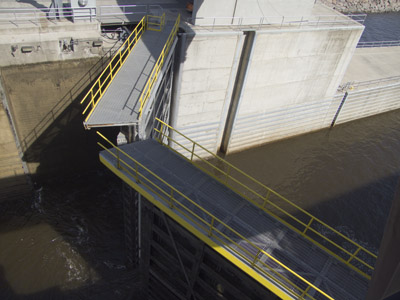
Illustration #1, above, photographed with my Fuji FinePix S100fs, shows what I mean. The luminance range in this scene fills the entire 11 stop exposure range of the camera, but a monitor (or worse still, a print) can't display that kind of range. This straight rendering from raw doesn't engage the senses.
(I made about 120 photographs in direct sunlight that day, but I had one heck of a time finding ones I could use for this article. Only five photos came close to using up the full exposure range of the camera. None exceeded it. Once more, I say: most of the folks who are complaining about the "limited" exposure range of digital cameras need to better explore how to use their cameras.)
How do you make a photograph like this look better? Find ways to accentuate the tonal differences, especially in the midtones, without throwing away highlights or shadows. The easy way to do that? Apply an S-shaped curve to the photograph, (illustration #2, below, upper left quadrant. Click on the image to see it a little larger). Highlights and shadows aren't clipped; they're merely compressed to allow the more important midtones to be expanded, improving their contrast. Color saturation is improved and the photograph looks clearer and more immediate.

For more emphasis in the highlights and shadows, Photoshop's Shadow/Highlight tool works a lot like split-filter dodging and burning-in the darkroom. It locally adds contrast to the end tones without excessively compressing the midtones (upper right quadrant).
Wide radius unsharp masking globally improves tonality and brings out texture is (see "How To Improve Digital Print Tonality"). It strongly emphasizes local differences in contrast without substantially increasing overall contrast. (Illustration #2, lower left quadrant.)
There are specialized tools that can do amazing things, adding snap and sparkle to a dull long-range photograph without altering the overall contrast one bit. My current favorite is ContrastMaster, a plug-in of daunting complexity that gives me pause. I won't even try to tell you how it works (I'm nowhere near entirely understanding it) nor how to use it, which would take a small book. I simply present one result in the lower right quadrant of illustration #2. This is only one of dozens of distinctly different interpretations I could have given the original photograph using this plug-in. The two illustrations below show a different ContrastMaster rendering, exaggerated for clarity. Same overall contrast range, same overall brightness, very different local tonality!


Main point is that there are myriad ways to skin this cat. All the examples in illustration #2 look a lot better than the straight rendition in illustration #1 (at least at full size on my calibrated monitor; who knows how they'll look scrunched down on the website. Remember, if the words don't seem to fit the illustrations, believe the words). There is no best or right rendering; that's where the art comes in. And if you don't my local contrast choices, go try some of your own!

"A reflection print is good for at best 7–8 stops. A good monitor may add a couple of stops to that, under ideal working conditions. (Ignore manufacturers' claims of 1000:1 brightness ranges; they come from lab measurements that have little to do with reality.)"
But Ctein -- 1000:1 is (almost exactly) 10 stops, which matches your 8+2=10 stops under ideal conditions. (However, I'm not saying that manufacturers' claims should be accepted prima facie.)
Posted by: T | Monday, 27 April 2009 at 06:03 AM
"I made about 120 photographs in direct sunlight that day"
Well, just try to avoid shooting during high noon, then you won't have to resort to photoshop trickery ...
Posted by: FS | Monday, 27 April 2009 at 06:40 AM
I have been applying an S curve with CaptureNX Level & Curves because I liked the results but was concerned that it was too simplistic so it is nice to see it's one of the recommended ways to "punch up" a photo!
Posted by: Bob Nichol | Monday, 27 April 2009 at 07:16 AM
There's a way of improving local contrast that I find extremely valuable: using the sharpening mask in Photoshop with a huge radius (closer to the size of the subjects than it's texture) and a very low amount. This is a relative increase in contrast, it will work in the highlights and in the shadows at the same time. Done carefully it gives wonderful results. With a very subtle approach it can make a picture look a lot less flat (you can take it all the way to a 3d look if that's what you want). I find it a lot more intuitive than the shadow/highlight tool. I'm doing two rounds of sharpening, one at texture level radius, and one at shape size level. I think it works very well.
Posted by: Max | Monday, 27 April 2009 at 07:40 AM
Interestingly this is why Velvia seems to boost colours.. It doesn't actually do so explicitly, it just boosts contrast.
Photographers who use Velvia tend to look for scenes that only have 5 or 6 stops of dynamic range (possibly a stop or two more if they can use a grad). These scenes work really well as prints because the natural dynamic range matches the range of most reflected media.
If photographers want shots that don't look lifeless, they should be hunting down conditions where the numbers of stop of dyanamic range is less, not trying to buy cameras where the dynamic range is better handled..
Posted by: Tim Parkin | Monday, 27 April 2009 at 07:43 AM
That USM tip from the link is pure GOLD! I just saved 4 strengths as Actions, and initial tests suggest that it is *exactly* what I was looking for...sometimes Clarity in LR2 is too obvious. Nik Software's Tonal Contrast Filter in Color Efex Pro 3.0 is another good way to max-out this effect, using the Layer Opacity slider if necessary. Thanks guys!
Posted by: Simon | Monday, 27 April 2009 at 08:40 AM
I like this article Ctein.
By "long range" you mean raw files with a lot of dynamic range?
Sorry if that is a stupid question.
Posted by: charlie d | Monday, 27 April 2009 at 09:25 AM
So, out of curiousity which locks on what canal? Appears to be be of recent construction,, however the colour of the water is something else!
Posted by: Bryce Lee | Monday, 27 April 2009 at 09:42 AM
Another great tool to control tonality is, quite simply, "Fill light" in Lightroom and ACR.
It's not unlike PS' Shadow/Highlight, but adds a bit more contrast in the dark/midtones range and moreover, it fits very well an "exposed to the right" image (ie an image exposed for the highlights, which leads to some underexposure in the shadows of a long range capture).
Don't forget to adjust the black level after Fill light (or you'll end with empty and drab shadows).
As usual, don't overdo it as it also boosts color saturation in the areas it affects.
Cat skinned yet another way...
Posted by: Nicolas | Monday, 27 April 2009 at 09:44 AM
Ctein- You may not know it but according to DHS you could be detained for probable cause for your photo's of this lock. As you mentioned you took over 100 photo's. That would appear to me that you were scoping the area out. Were you taking notes while at this facility? Did you have a map of the area with you? Why did you need a close up photo of the lock mechanism? No normal person would need a photo of gears and such.
Next time you better review these before taking pictures.
http://www.vsp.state.va.us/FusionCenter/7-Signs.shtm
http://www.youtube.com/watch?v=Mb1gaQfWZT0
Posted by: MJ | Monday, 27 April 2009 at 10:40 AM
"Illustration #1, above, photographed with my Fuji FinePix S100fs, shows what I mean. The luminance range in this scene fills the entire 11 stop exposure range of the camera, but a monitor (or worse still, a print) can't display that kind of range."
If I am reading this correctly, you are saying that you are getting 11 stops of range from a point and shot. How do you do that in a single pass?
PS: Apparently the old Sony Artisan CRT could hit a contrast ration of about 1200:1, if properly calibrated. I think the closest display on the market is the HP Dreamcolor LCD, which was developed as a direct replacement for the Artisan...
Posted by: Harry Lime | Monday, 27 April 2009 at 11:03 AM
I don't have much printing experience. What is meant by a "reflection print?" Also, what kind of dynamic range do our eyes have? Clearly, we can see more detail than our monitors can display, or film can print, so it must be vast.
Posted by: Scott | Monday, 27 April 2009 at 11:08 AM
Dear T.,
Your interpretation eliminated the "at bests," "mays," and "ideals" from what I said, turning (im)probabilistic assumptions into absolutes. Good luck realizing that in practice.
=======================
Dear Charlie,
Nope, that's a fine question. "Long-range" refers to the subject matter. It's a shorthand way of saying "a scene with a luminance range that covers a lot of stops." Obviously you'll need a RAW file (with today's technology) to have a chance of capturing that range, but that might not be true in the future.
=======================
Dear Bryce,
Mississippi Dam and Locks Number One, don't know the last (re)construction date.
=======================
Dear FS and Tim,
I would assume you're both joking, but in case some readers out there think you're not...
First off, I wasn't even out the door at high noon that day. Direct sunlight is direct sunlight for most of the day. Maybe some photographers want to photograph only on hazy or overcast days; I don't.
Second, photography is my tool and not the other way around. My goal is to make prints that render the wonderful things I see the way I see them to the best of my ability. Not the minimal subset of those that my tools think are easy to handle.
One of the great things that happened for me was undertaking dye transfer printing and contrast control masking in the mid-70s. Once I learned those printing methods, I could artistically render any luminance range my films could capture in a print, with sufficient effort. It meant I didn't have to limit myself to situations the print paper could handle; I only had to limit myself to situations that *I* could handle. Check out most of my night photography (often far worse luminance ranges than direct sunlight) and the photos in my "Chasing the Sun" portfolio (http://ctein.com/Baja_portfolio.htm) and try to tell me that I should've limited myself to those "sweet hours" around dawn and dusk.
=======================
Dear MJ,
Chuckle!
Not to worry... my motto is DHS can BMA.
~ pax \ Ctein
[ Please excuse any word-salad. MacSpeech in training! ]
======================================
-- Ctein's Online Gallery http://ctein.com
-- Digital Restorations http://photo-repair.com
======================================
Posted by: ctein | Monday, 27 April 2009 at 11:44 AM
I've been photographing nearly 60 years, and have never "shot" 120 images in one day.
Once, when I made my very first visit to Point Lobos I took three rolls of Kodachrome II (108 pictures, none of which was worth printing).
Since going digital I sometimes end up with 60 images by bracketing a lot, but 120/day -- never!
Posted by: Wilhelm | Monday, 27 April 2009 at 12:36 PM
Great article as always, Ctein. Here's a method I developed that I really enjoy for adding increasing dynamic range without flattening it too much. Sometimes it works better than others.
•Duplicate the main layer.
•Image > Adjust > Shadow/Highlight.
•Set both Shadow and Highlight layers to maximum. This will look horrible. Don't worry.
•Set that layer to a blend of 'Soft Light'. Better, but too saturated.
•Layer > New Adjustment Layer > Hue/Saturation. In the New Layer box, click the box next to 'Use Previous Layer to Create Clipping Mask'.
•Drag the Saturation to the left. I slide it to about -70.
If it looks a bit over-cooked, reduce the opacity of the first duplicate layer you created.
A good method for increasing local contrast which I sometimes use in conjunction with the first method I described, is to simply duplicate the background layer, set it to a blend of 'Soft Light' and an opacity of ~80%. You'd also want to desaturate that layer as well.
Posted by: Damon Schreiber | Monday, 27 April 2009 at 12:37 PM
Ok, I'm an idiot. I didn't read the whole thing and what I said before was already mentioned in the original. Well, at least I wasn't misguided about the apparent value of that technique.
Posted by: Max | Monday, 27 April 2009 at 12:37 PM
And since somebody mentioned Velvia, that's pretty much what you can achieve through the USM trick, something Velvia-like.
Posted by: Max | Monday, 27 April 2009 at 12:40 PM
Since MJ posted the paranoid side of the story, here are a several blogs that are working to inform photographers of their legal rights. Basically, if you were on public property or property normally open to the public than you can photograph what you see. There are some exceptions but those are mainly military. Know your rights and protect them!
The blogs are:
http://www.photoattorney.com/
http://carlosmiller.com/
http://www.nycphotorights.com/wordpress/
Posted by: AE | Monday, 27 April 2009 at 12:47 PM
Tim-
The "Velvia æsthetic" has dominated nature and landscape photography for decades. We've become accustomed to neon color saturation and subjects with the relatively low contrast range Velvia can handle. Hence we see lots of fall color in overcast weather, or landscapes shot in very warm first/last light. The contrast limitations imposed by the film, and its surreal color interpretation, has come to so completely dominate the landscape photography æsthetic that it's becoming difficult to find anything else.
I really like Stephen Johnson's take on this. A true pioneer of digital capture, he argues for a much more faithful rendition of subject colors together with exploiting digital capture's ability to handle more contrast than Velvia. Many of his images are shot in relatively harsh light, yet still look beautiful, and they're far more true to life than the garish Velvia æsthetic. It may not 'sing' for you, but to my mind it's an escape from the Velvia straightjacket.
Posted by: Geoff Wittig | Monday, 27 April 2009 at 12:59 PM
You think you have a problem. Here in the UK we have to try and fit 20 fluid ounces into your 12 ounce tin!
I always felt short-changed with your pints ...
Posted by: steven House | Monday, 27 April 2009 at 02:03 PM
"Ok, I'm an idiot."
Max,
Don't feel bad. People often ignore links while reading along.
Mike
Posted by: Mike Johnston | Monday, 27 April 2009 at 03:08 PM
Dear Harry,
(Check my review from last summer of the S100fs. The 11 stop range is a plain, vanilla RAW capture at ISO 100.
Large sensors/large pixels give one a leg up on image quality, but the relationship is by no means monotonic. Without looking at a particular camera's performance, one should no more buy a camera based on sensor size than on pixel count or pixel dimensions. There are broad correlations with quality but large numbers of exceptions.
Problem with trying to get a really long tonal range out of your monitor is that the operation and viewing conditions have to be essentially perfect. And almost nobody works that way in real life. So it's a bogus number. Kind of like the extremely high densities that are quoted for some matte print papers (both darkroom and digital). You only get that deep a black in a situation where scattered light doesn't matter, and good luck finding a viewing situation for a matte print where it doesn't!
=================================
Dear Scott,
"Reflection prints" are ones that are viewed solely by reflected light (no, before someone asks, that isn't the only kind of print). The density range one can then portray and view is limited by a number of factors, but you rarely do much better than seven stops. A true eight stops is uncommon. Beyond eight stops requires things like dye transfer prints and specialized illumination.
The dynamic range of the human eye is both peculiar and adaptive. See this previous column.
=================================
Dear Wilhelm,
I agree. Did you read this column just a couple of weeks back? (And am I approaching the point where I can answer all questions by just referring to my previous columns?!)
I'm still having to train myself to cut back.
On the other hand, at even a cursory glance at least three of the photographs are worth adding to my portfolio and it's possible there will be several times that (note: the photographs in this column were chosen because they best fit my needs for illustrating my points, not because they were the best of the day). Which is extremely good for one day's photography! In fact I have enough photographs that I like from that day that I'm thinking seriously of doing a chapbook.
~ pax \ Ctein
[ Please excuse any word-salad. MacSpeech in training! ]
======================================
-- Ctein's Online Gallery http://ctein.com
-- Digital Restorations http://photo-repair.com
=====================================
Posted by: ctein | Monday, 27 April 2009 at 04:12 PM
Geoff, I couldn't remember where I read recently the recommendation to shoot even when the sun is too "hot" for Velvia, but it was definitely Stephen Johnson.
It really is pretty amazing how digital capture gives me "keepers" in situations where I would have chosen not to waste film in the past. (Some film fans on other forums argue that such and such an emulsion captures more contrast than any digital sensor ever could ... but apparently I never chose that film :) One of the dilemmas I face when post-processing is how much detail to pull out of the shadows. I tend to lighten the shadows and show detail just because I can, but sometimes wonder if the result is better or worse than if I'd left them darker. It's something I'll pay more attention to going forward. On the highlight end of things, it's not such a dilemma for me; once in a while, recoverable highlight detail makes the shot; often it adds nothing to the picture and I happily let the highlights be blown in exchange for the added contrast.
Posted by: Dennis | Monday, 27 April 2009 at 04:19 PM
"Beyond eight stops requires things like dye transfer prints and specialized illumination."
I remember when Charles Philips did a presentation in my loft in Chicago. He showed a print of a snow-covered mountaineering scene about four feet high (one of his smaller sizes) that looked dark and murky. Then he set up an extremely bright spotlight in front of it and turned it on, and whammo. Really impressive. To show his work properly, a museum would need a darkened room and special lighting.
Mike
Posted by: Mike Johnston | Monday, 27 April 2009 at 05:48 PM
Nobody else mentioned "ContrastMaster".
I tried it, liked it, bought it.
THANKS !!! Kenneth Voigt
Posted by: Kenneth Voigt | Monday, 27 April 2009 at 08:58 PM
Dear Damon,
I will have to give that a try!
I have a fair bit of trouble visualizing what the non-obvious blending modes do. Mostly I mess with them by trial and error. Did come up with a visualization technique that helps me better understand how they change things. Come to think of it, that would make a good column. Okay, I know what I'm going to write at the end of the week!
Thanks!
~ pax \ Ctein
[ Please excuse any word-salad. MacSpeech in training! ]
======================================
-- Ctein's Online Gallery http://ctein.com
-- Digital Restorations http://photo-repair.com
======================================
Posted by: ctein | Monday, 27 April 2009 at 09:26 PM
Great article. Thanks for sharing.
Posted by: photoshop image masking | Tuesday, 28 April 2009 at 12:02 AM
I discovered the wide radius USM trick some time back - but for a totally different reason - I was trying to reduce haze (well light fog actually) in some shots.
For the very same reason it works to enhance local contrast, it makes a very effective anti-haze filter (though quite useless for heat haze which may actually distort the image).
I bet most people have some landscapes which could really benefit from this.
Cheers,
Colin
Posted by: Colin Work | Tuesday, 28 April 2009 at 07:03 AM
Ctein,
thanks for addressing something that's been occupying my mind for a while now, the need for "realistic" light in a photograph.
In fact, I wrote something about it just around a year ago:
http://www.drivingtheflies.com/?p=242
and this is probably the best example of the results of those thoughts from that trip:
http://www.drivingtheflies.com/?p=255
best,
Doug Brewer
Posted by: Doug Brewer | Tuesday, 28 April 2009 at 08:45 AM
Actually...we have the technology. Maybe someday we'll actually be able to buy it.
Posted by: Randolph | Tuesday, 28 April 2009 at 04:52 PM
Great article. There is another great article about the USM trick for local contrast enhancement, which also explains why it works: http://www.cambridgeincolour.com/tutorials/local-contrast-enhancement.htm
Posted by: Aman Gupta | Tuesday, 28 April 2009 at 05:07 PM
Dear Randolph,
Yeah, they claim: "Contrast ratio > 200,000:1"
This is just the kind of bogus spec I was talking about. You'll never see anything remotely close to that under any kind of real-world viewing condition.
I'm sure it's a lovely display, but that's simply an impossible number to achieve outside a highly contrived laboratory measurement.
pax / Ctein
Posted by: ctein | Wednesday, 29 April 2009 at 03:38 AM
Ctein,
many thanks for the artice, it really changed my understanding of curve adjustments.
I tried a horizontal gradation curve and the result is just gray, for an inverse one, I get inverse hues.
However, I allways thought that in camera processing (as well as the first stage in RAW converters) would work differently in using HSL instead of RGB.
Then one could simply keep hue and saturation unchanged while compressing the luminance range.
When I try contrast or HDR sliders in Capture One I am under the impression that there is no desaturation neither effects on hue. Similarly, Canon's photo style editor works in HSL, but I am not sure how the gradation curve is applied.
Any ideas whether the first processing stage works differently than the usual curve adjustment?
Regards, Jan
Posted by: Jan | Wednesday, 29 April 2009 at 11:32 AM
So what we're saying is that, in a camera, the quest for large dynamic-range is as non-comprehensive a single metric as the search for largest number of megapixels, right? (I'd agree with that.)
You can throw tonemapping into the mix - normally deployed after HDR (the combination of multiple exposures into a file of very high dynamic-range), tonemapping algorithms often use spatial-local contrast-improvements to make it look normal again.
So what we're saying is that around 10-11 stops' DR in the RAW file is effectively an "HDR camera"? (I might agree.)
To the commenter who thought sigmoid curves were simplistic, additionally experiment by waving the picker brush over the areas in the scene where you want to boost contrast, and then when the highlight in the curves dialog tells you where the tones fall, arrange for that area of the curve to have high gradient. If your image has a few separate sections (eg dark foreground, nothing much in the midtones and then bright sky) then making each section have increased contrast is also an option. It makes for quite wiggly curves lines that you might not always expect.
To the commenters talking about Velvia: the characteristic response curve of film quite often expands the output contrast from around the midtone, which is why you can take a scene of a limited number of stops' contrast, set it on the midtone and the film effectively expands the dynamic range output for you (at the expense of outlying zones). This is partly why simply pointing a wide-angle meter at a scene does actually work...
Posted by: Tim | Wednesday, 29 April 2009 at 02:32 PM
Dear folks,
A postscript to this monitor business: I just measured the luminance range of my Apple Cinema Display. It's about 250:1. That's with a fair amount of uncertainty, but it's nowhere near the 700:1 claimed in the technical specs.
That's also under ideal viewing conditions. I don't work in a blackened room with extreme care taken to ensure that there is no light scattered off the display. So my real and practical working luminance range would be even less than 250:1.
~ pax \ Ctein
[ Please excuse any word-salad. MacSpeech in training! ]
======================================
-- Ctein's Online Gallery http://ctein.com
-- Digital Restorations http://photo-repair.com
======================================
Posted by: ctein | Wednesday, 29 April 2009 at 03:01 PM
Dear Jan,
Messing with this stuff in HSL (or Lab) space does work differently from doing so in RGB. But the differences appear mostly at the extrema and you may never notice them in practice.
In practice, you can obtain a good approximation to working in those spaces by making your adjustments in RGB space and then using the "Fade..." option in the Photoshop menu with your most recent adjustment. When you open up that control, you'll see a drop-down menu with different blend modes. If you only want to affect luminosity, select that as your blending mode (leave the strength at 100%).
This doesn't produce quite the same effect as working natively in one of the other spaces, but it's usually close enough for jazz.
I'm not a big fan of trying to fine tune an image too much in the RAW converter. I'm leery of making any adjustments there that could clip information that I might find a want to retain later. Mostly I use ACR to get the color balance and exposure approximately right, insure that I'm really importing the full range of tones that I captured, and correcting some lens and camera aberrations. I leave the "artistic" work for Photoshop.
That's my style; it doesn't have to be anyone else's. It only means I'm not a good person to come to for a discussion of the nuances of refining an image in a RAW converter.
~ pax \ Ctein
[ Please excuse any word-salad. MacSpeech in training! ]
======================================
-- Ctein's Online Gallery http://ctein.com
-- Digital Restorations http://photo-repair.com
======================================
Posted by: ctein | Wednesday, 29 April 2009 at 03:11 PM
The s-curve adjustment seems to be flattening the toe and shoulder of the slope, reminiscent (to me, at least) of the old H&D curves for film.
A.A. is surely chuckling in his grave.
Thomas
Posted by: Thomas Johns | Wednesday, 29 April 2009 at 05:46 PM
Dear Thomas (and Bob),
I rather doubt that. I can't muster all that much authority speaking for the dead (hardly any of them give me the time of day), but Adams was no stuck-in-the-mud classicist. He enjoyed new photographic technologies and he loved being able to apply his classic body of knowledge to them (that's one thing we have in common... along with a strangely creaky-sounding voice). In fact his Polaroid (the digital of its day) book was arguably the definitive work on how to use Polaroid films well.
All darkroom-based negative film/paper combinations and slide films have an S-shaped curve. It produces satisfactory results a great deal of the time. That's why hardly any darkroom printers (less than 1%) ever explored ways of substantially modifying that curve and why the default curve shape in many RAW converters is an S-shaped one.
Using an S- shaped curve isn't simplistic nor ironic in any way. It's simply a standard tool for remapping subject luminances to print densities in a manner that emphasizes the tonal information we most often care about and looks pleasing.
~ pax \ Ctein
[ Please excuse any word-salad. MacSpeech in training! ]
======================================
-- Ctein's Online Gallery http://ctein.com
-- Digital Restorations http://photo-repair.com
=====================================
Posted by: ctein | Wednesday, 29 April 2009 at 06:49 PM
Dear Tim,
I don't think that's quite what I said, but I don't have much argument with it either. Mind you, I've done very, very little with HDR. My current camera has sufficient exposure range that it's almost never necessary, and the exaggerated HDR look doesn't appeal to me as an artistic style. To make matters worse, because of my relative indifference to the style, the only HDR tool I've used is the one built into Photoshop, which is quite inferior to other software out there (which I do know about, so I don't need recommendations from people).
The ContrastMaster plug-in can create that weird (to my eyes) balance between high local contrast and low global contrast that is the characteristic HDR look. Whether taking an 11-stop-range single photograph and massaging it that way produces the same look as HDR is honestly something I don't know.
I might try experimenting at some point. As it happens, the second photograph in this column had a long enough subject luminance range that I wasn't convinced a single exposure would capture it all (I was wrong about that), so I also did a three exposure +/-1 stop bracket on a similarly composition. I might try taking those three photographs and HDRing them together and seeing if the result looks significantly different from a single well-exposed frame. I don't know the answer.
~ pax \ Ctein
[ Please excuse any word-salad. MacSpeech in training! ]
======================================
-- Ctein's Online Gallery http://ctein.com
-- Digital Restorations http://photo-repair.com
======================================
Posted by: ctein | Wednesday, 29 April 2009 at 06:57 PM