Written by Ctein
[Note: This is going to be longer than your usual TOP post. There's a lot to talk about. If you feel it's “longior, non legi,” don't say I didn't warn you!
P.S. Two important illustrations were missing from the first post of this article (under the nighttime snow photograph). If you didn't see'em before, refresh and scroll down. —Ctein]
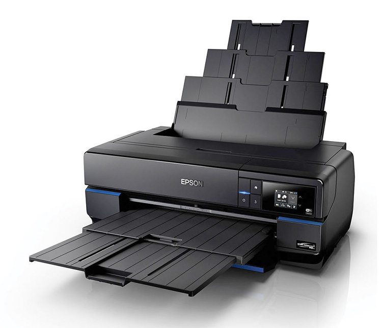
The new Epson SureColor P800 printer (currently specially priced at $995 from B&H Photo after the mail-in rebate) is the 17-inch wide model in Epson's new line of printers that run from 13-inch wide through 44-inch wide. The print quality should be similar or identical on all of them. I reviewed the P800 because it's the direct successor to my current standard printer, the Epson 3880.
The big deal about the Epson SureColor P800 (hereafter simply referred to as the P800) is Epson's new Ultrachrome HD ink set. It's the same set of colors as in the x880 series—MK,PK,LK,LLK,LM,M,LC,C,Y—but they've been reformulated for an increased density range. More density range means richer blacks, more tonal range to work with in the print, and higher maximum saturation in the colors. This, of course, is what got me most interested in this printer. More on this anon; much more.
There are couple of other new features to the printer that I liked. You can tether it to your computer with the standard ethernet or USB cables, or it can connect over your Wi-Fi network. I didn't relish stringing another cable across my office, so I gave the Wi-Fi option a try. All of my testing was done on my 27-inch 5K retina iMac running the most current versions of Mac OS X (Yosemite) and Photoshop CC (2015). Wi-Fi worked perfectly. I performed the usual setup dance: first install the printer software on the computer, then turn on the printer. I next selected wireless connection from the touchscreen on the front of the printer. The printer looked for the Wi-Fi network, configured itself appropriately, and that was it! The printer was installed on the iMac and also accessible from any other computer in the house that was on that network. Easiest setup I've ever had.
Another feature I especially liked was that you can tell the printer whether it should be able to automatically switch between matte black and photo black inks depending on the print medium, or whether it will require you to manually initiate the switch (in which case the software will prompt you that the printer needs your attention). Why do I like this? Because I have, on occasion, accidentally chosen the wrong print medium, or decided to, say, print out an invoice that just came in while I'm in the midst of working on photographs, forgetting I'm set up for the latter. With the “convenience” of automatic ink swapping, I am rewarded by wasting five or more minutes of my time switching between inks, not to mention a few dollars worth of ink going down the drain. The first time I made this mistake with the P800, which happened pretty quickly (in my defense, I was making a lot of test prints under a lot of different conditions) I switched the printer over to manual. It's pretty good proof against the particular kind of fool that I am.
No doubt that there are a bunch of other features that will matter to other people. I didn't use them, so I won't report on them.
One negative change: the printer ships with smaller starter ink cartridges. Oh, they're not a whole lot smaller, probably 20%. The printer seems to require less ink to charge the system initially, so I'm likely getting close to the same amount of usable ink from the cartridges that ship with the printer as I did with the 3880. But, really, it feels kind of cheap on the part of Epson—would it have killed ya to have given me the full 80 ml cartridges? Really?
There, I got in my gripe. On to the prints, which is what we all really care about.
Print quality
The first thing I looked
at was the ink droplet pattern, because that was really easy–– one test
print. I was curious to see if the P800 was a big improvement over the
x880 series the way the x900 series is. The pattern didn't look
substantially different from the 3880, not in the league of the 4900.
But, my particular review unit checked out at the high-end of the
quality/uniformity range of 3880 printers that I tested a while back.
The dot pattern was very uniformly spaced, invisible to my eye even under the closest inspection. That is not true of my 3880, which falls in the middle of the quality distribution. I don't know if this is typical of the P series or if I just got lucky on this test unit. This could be a case where “your mileage will differ;” no way I could say without testing a couple of dozen of these printers. The P800's sharpness was slightly better than 3880, but that might just be due to more uniform dot pattern. (Any Epson people reading this, feel free to chime in with observations, on or off the cuff. Hint, hint.)
So much for ink droplet patterns and print sharpness. Let's talk about density range, what the fuss is about.
The short version: it is consistently better on all papers, both matte and gloss/semi-gloss, than the 3880. I don't have a reflection densitometer; to my eye it looks like about a 0.2 density unit improvement in the shadows. There is distinctly better separation in the lower tones (below value 20) but pretty much no difference in the midtones and highlights. It's an extended shadow range.
This is my standard grayscale test target:
You can download a variant of this for your own tests.
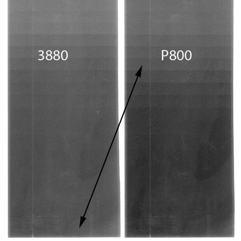
The following illustration shows an enhanced version of the lower half of the rightmost column in my test prints, which prints values from 0 up to 32, just the darkest shadows. I kicked the brightness and contrast way, way up in the scanner software, so there are lots of scan artifacts and blotches.
These comparison prints, on Canson Baryta Photographique (my preferred paper) give you an idea how much further down the blacks extend with the new printer. The black arrow shows the matching steps between D-max on the 3880 print and the P800 print (around value=15). The darkest steps, down to the last 2 or 3, are visually distinguishable in the P800 print under strong illumination, even though they merge together in the scan; the printer does hold separation in the shadows.
The improvement in density is especially noticeable with a paper like Epson Ultra Premium Matte, a lower grade matte paper with relatively weak D-max. A P800 print on this paper has better blacks that a 3880 print on Epson Hot Press Bright, a much better quality of matte paper. Of course, a P800 print on the Hot Press looks better still, but this printer is a great equalizer among matte papers.
What does 0.2 d.u. mean, visually? With a semi-gloss paper like my Canson, a typical high-end inkjet print has about the same density range as a high-quality darkroom print. A dye transfer print, the gold standard, would typically have 0.4–0.5 d.u. more density range than the best darkroom print (that can vary). The P800 pushes well beyond what one can get in a conventional darkroom print; it's about halfway to the density range of a dye transfer print. It's going to encourage me to try digitally printing some of my photographs that simply don't print well without the density range I could get out of dye transfer, notably my "Jewels of Kilauea" series.
I'm jazzed.
The higher density range also means you can print richer colors and a larger color gamut. The maximally saturated primaries can get more saturated. Understand that this does not mean that your print, overall, is more contrasty or more saturated. It's about the range you have to work with. Think of it as like getting a new digital camera with a longer exposure range than your old one had. Your photographs aren't more contrasty, overall, but you can capture more of the extreme brights and darks.
Will you see this in your prints? It'll depend upon the kinds of photographs you make. The improved density range has only a minimal impact on photographs that don't have important shadow detail. If you mostly photograph high key, you'll never see a difference. Similarly, unless your photograph has colors that push the limits of the color space or of saturation, the extra range this printer provides will be less important. In some of my photographs, I could see very little difference between the 3880 and the P800 unless I looked very carefully. In most there was some improvement.
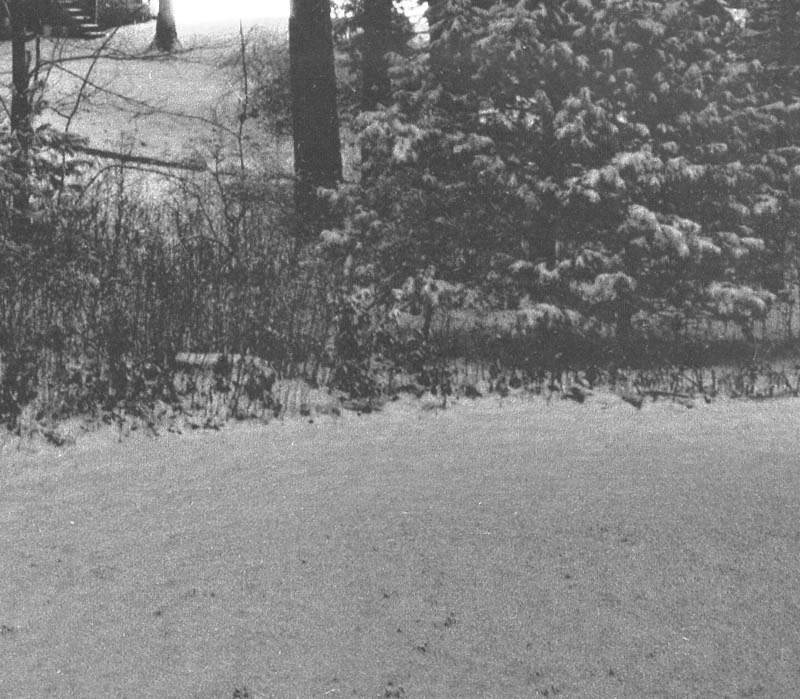
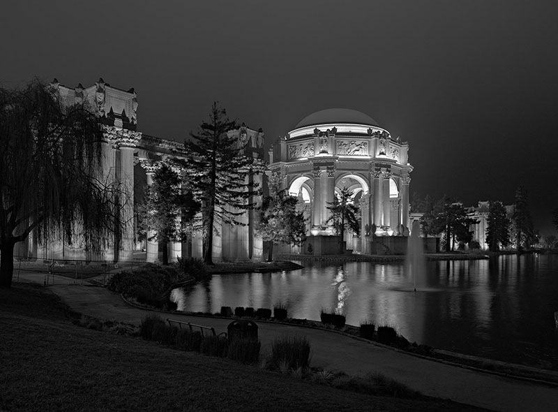
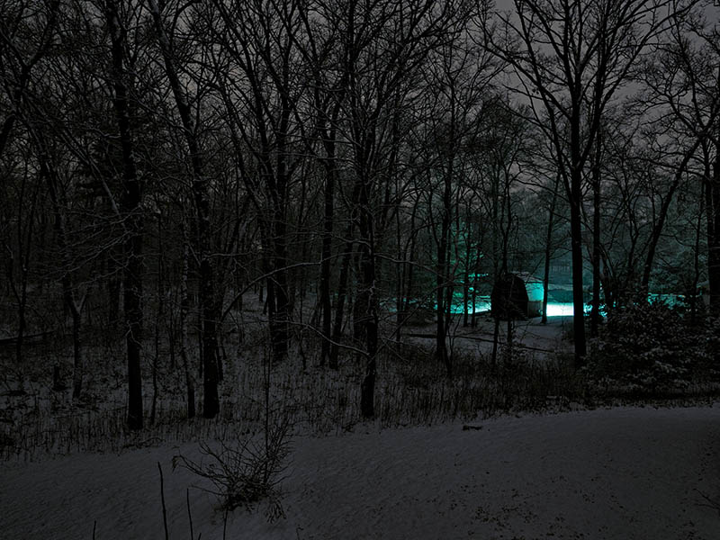
In some, the difference was profound. Photographs like this one:
and especially this one:
...printed much better with the P800. When I made that series of nighttime snow photographs, I remember telling Mike that I had to work very hard to hold separation in the shadows and still print the photo down dark enough that it looked like a night scene. I was hoping that future printers would let me do a better job. This printer does. I was satisfied with the rendering I achieved on the 3880, but I like what I can do with the P800 a lot better.
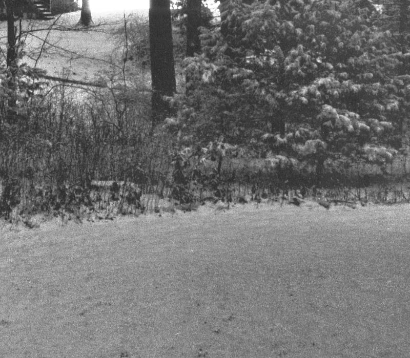
These two scans enlarge a portion of this photograph near the right edge:
I've brightened the image and enhanced the contrast the same way I did with the gray scale scans, so you can see the difference in the shadow rendering between the 3880 (upper) and P800 (lower) prints. That is a subtle improvement in the print, but it makes a big difference in conveying the fine detail and producing a sense of depth in the shadows.
Am I going to go back and reprint my whole portfolio now that I have a better printer? Hell no. Better may or may not be the enemy of good, but it is certainly the enemy of deadlines and of making new work. I'll be selective. But, I will be reprinting some of my portfolio. It's worth it.
Now I move on to a more controversial subject (cue ominous music):
Color management and profiling
The main reason this review took so long to get done is that Dave Polaschek, Andrew Rodney and I continued our investigation of color management and profiles, and it turned out to be rather more complicated than expected.
Well, some weeks and well over 100 prints later (whew!), I've reached my conclusion. Printer-managed color is the way to go with an x880 or P-series Epson printer running under Mac OS. A majority of the time it produces better results than Photoshop-managed color with a good custom profile. Sometimes it's massively better. Otherwise, it's usually a tossup. A very small fraction of the time, the custom profile works better, but never fantastically better.
Why is this so? I have no idea. I can spout all sorts of logic and theory that says this should not work anywhere as well as it does. But as I repeat, ad nauseum, “Data trumps theory.” I've got an awful lot of data now.
If you're really obsessive, I suppose you can run out a bunch of test prints of each and every photograph you do, to compare printer-managed color to custom profile color (remembering that you need to try out both relative colorimetric and perceptual rendering intent). Am I going to do that?
Naaah. It'll be printer-managed color and that's that, unless I look at the print and decide something is wonky.
I will likely explore this topic in more detail next week in a column. I would prefer to not, repeat not, argue about it in this one, especially if it's a rehash of what we discussed before.
Here are the settings you need to know. When you pull up the printer control panel, choose “Printer Manages Colors” under Color Handling. Then click Print Settings… . Select the Color Matching submenu and click “Epson Color Controls.” Click the Printer Settings submenu and under Color Mode choose “Color Controls > Adobe RGB.” Choose the paper type that most closely matches the one you're using (it doesn't matter if there's an exact match—I rarely use Epson papers).
I reprinted one of my recent favorite photos on the P800 using printer-managed color. This photograph looks great with my usual custom profile on the 3880, but it's got a lot of out-of-gamut color (including pretty much the whole “sun” lamp) and it pushes the brightness range per print. Wow, was there ever a difference! It's hard to find a way to put into words (and it is, of course, impossible to illustrate here) but the P800 print is much more alive. The color is more accurate, there is separation and texture in the extremes of tone and color that's missing in the 3880 print. The latter looks flat, compared to the new print. I loved the old print. I love the new print.
Printer-managed color won't be good under Windows. Windows limits you to sRGB color space when printing in this mode, and that's just not enough. Stick with custom profiles for Windows. What about other printers, models and makes, on the Mac side? I have no idea; you have to run your own tests. Ya pays yer money and ya takes yer chances.
Conclusion
I've put in a request to buy
my review unit. Not because I'll necessarily save much money buying it
that way, especially with Epson's current $200 rebate through the end of
October, but this printer is performing well and, noting my earlier
comments on product variability, I'm getting a nice tight dot pattern
out of this printer. I don't want to leave that to chance. And I don't
want to have to pack up and return a printer and then unpack and set up a
new one. Because, really, I am replacing my 3880 with a P800 either
way.
Don't misunderstand; there is nothing wrong with the 3880, and if the P800 hadn't come along I'd still happily continue to use it. If you can grab one (new or used) for, say, 50–60% of the price of a P800, do so. Otherwise, there's no question in my mind that the P800 is worth the extra money.
Ctein
[The P800 from B&H Photo is currently $995 after the mail-in rebate. The smaller 13-inch P600 is around $570 with the rebate. IMPORTANT! The P800 rebate offer is good through October but the P600 rebate offer ends September 30, so you've only got a week on that one.]
Ctein is TOP's Technical Editor and a longtime professional custom printer.
©2015 by Ctein, all rights reserved
(To see all the comments, click on the "Comments" link below.)
Featured Comments from:
Bill Mitchell: "What is 'printer managed color'?"
Ctein replies: Bill, when the Print Settings control panel in Photoshop comes up, under "Color Management" there is a "Color Handling" setting. You can choose either "Printer Manages Colors" or "Photoshop Manages Colors" The latter lets you (well, requires you) to use a printer profile selected from the menu below that. The former shuts down Photoshop's control of the color and leaves it all in the hands of the Printer Control panel that pops up when you click "Print Settings...". In other words, it's a completely intuitive interface. Not.
Craig Arnold: "A wonderfully timely post. I've decided it's time to retire my older Canon dye printer. As my favoured print size is A3+ I don't have to have the P800, but it's not much more than the P600 and the bigger ink tanks make it a bit silly to go for the P600. However I am somewhat conflicted over the choice between the P800 and Canon Pixma Pro 1. Do you have any experience of the Canon?
"Also, there is much Internet angst over 'pizza wheel' marks on the P800 prints. I presume this is only with certain papers, but have you seen such a thing?"
Ctein replies: Craig, Sadly, no recent Canon experience. However, I just made a usage agreement with them for four of my photos, so I'm hoping they'll send me sample prints over time.
I've not experienced pizza wheel marks with any of my 3880's or the P800. I'm pretty sure the technical explanation is that the gods favor me and punish others because they are not so pure of heart and noble of spirit as I.


Do you have any sense of the difference between the 3880 and 4900, i.e., how might this compare to the 4900?
[Ctein replies: Ed, I'm going to engage in a certain amount of guesswork, because I've done very little with the 4900. The dot pattern on the 4900 will still be finer, but my P800 unit is good enough that I don't care. They may all be that good, but I don't know. The two extra ink colors in the 4900 give it a bit of a boost in the color gamut, but my strong impression is that the D-Max in the 4900 is no better than the 3880. In that case, what I said about improved tonality and color in the P800 ought to apply in comparison to the 4900 as well. But, guessing.]
Posted by: Ed Richards | Wednesday, 23 September 2015 at 08:34 PM
Ctein, could you mention what paper choice setting you found best for the Canson paper? Thanks.
[Ctein replies: Charles, this is a funny business. I've used three very similar (in look, anyway) baryta-type "air-dried F" surface papers. For one of them, the paper manufacturer recommended the printer be set for "semigloss" paper. For the second, "gloss." The Canson data sheet didn't say. So I flipped a coin and decided "semigloss." Y'know, I don't think it much matters]
Posted by: Charles Rozier | Wednesday, 23 September 2015 at 08:35 PM
longior, non legi ... per adesso
I just received my P600. Aside from a quick shot with my two standard test images, just to make sure that the thing worked,and that there were no hidden problems, I have not yet used it. I've been too danged busy to give it a workout.
My 2880 sold in less than 24 hours on eBay, so with the rebate, the P600 is almost free!
Posted by: MikeR | Wednesday, 23 September 2015 at 08:37 PM
OK, I admit I haven't done any tests of my own yet since I just saw your review, but I'm a bit confused by your "printer manages color" recommendation. Does soft-proofing still work properly if you turn the color management over to the printer? (I print from Lightroom, in case that's relevant.) It's not evident to me how you can anticipate the print's appearance if you allow the printer's firmware to interpret the Adobe RGB colors you transmit to it.
I'm not arguing, mind you. I just don't understand how this would work.
[Ctein replies: Chris, I would note that this is a place where Andrew Rodney and I strongly disagree, but I find soft proofing to be pretty inaccurate. It tells me roughly how the tone and color will transform when I print a photograph, but doesn't tell me anything about the nuances and subtleties that make or break a print for me. So, for me, soft proofing is an "I'm in the ballpark" tool. I find that the differences in appearance between the soft proof with different profiles is smaller than the difference between a soft profile and a physical print.
Accordingly, I am entirely happy with an approximate soft proof. I just grab the canned profile that's closest to the paper I'm printing on and tell Photoshop to use that for soft proofing. It tells me as much as I'm going to learn from a soft proof.
I don't use Lightroom, so I have no idea if things will be different there.]
Posted by: Chrs Kern | Wednesday, 23 September 2015 at 09:03 PM
Ctein, can you give us a better idea of the color space coverage for the new Epson inks? Such as larger than RGB, or around the range of the pro-photo color space. If I was not having some house contruction work done I would be ordering the printer.
[Ctein replies: Mathew, Ummmm, nope. I've got no way to measure such things. I think Googling "color gamut" and "P600 (or 800) printer" would get you some such.]
Posted by: Mathew Hargreaves | Wednesday, 23 September 2015 at 09:05 PM
Nice review...I'm sold. Now if I can just convince someone to take my HP B9180 off my hands, I can move forward.
Posted by: k4kafka | Wednesday, 23 September 2015 at 09:49 PM
Very timely review. I've used a 3880 for years, and all of a sudden it needs multiple new ink cartridges! That, and I've been printing a lot from Sigma DP Merrill cameras, B&W prints, and as astounding as they are the better handling of blacks and detail will help.
My preferred paper is Epson Cold Press Natural, which complements the vision I have in mind for the prints. I have been using Pixelmator for printing, after processing in Sigma Photo Pro and then refinement in Iridient Developer.
One thing that bugs me about the 3880 is that getting paper properly lined up in the rear - for thicker matte papers - is dicey. I often have to try and try again to get the paper properly inserted. I hope this too has improved with the P800.
In any case, printing is really fun and rewarding. Viewing images digitally becomes dissatisfying in comparison.
Posted by: Andrew | Wednesday, 23 September 2015 at 09:56 PM
Do you use the ABW (advanced black and white) mode for b/w prints, or stick to your same workflow for b/w as you describe here for color, for instance using Canson Infinity Baryta Photographique?
[Ctein replies: Jeff, I print everything, including my B&W infrared photos, as if they were color. ABW is really slick and produces great results, but I am not a fan of it for reasons I expressed in my comment to this column.]
Posted by: Jeff | Wednesday, 23 September 2015 at 10:40 PM
Any comments on paper feed? It's my understanding that all thick papers must be fed from the front with no option for rear feed. Is that correct? Sounds like something I wouldn't be happy with, but maybe I would just get used to it after using it for a while.
Also did you try out the optional roll feeder? If not do you plan to? I wonder how useful it is without a built in cutter.
[Ctein replies: BJ, personally I'd rather be feeding paper from the front than the rear. I've got easy access to the front. I didn't test the roll feeder.]
Posted by: B.J.Segel | Wednesday, 23 September 2015 at 11:18 PM
Ctein, thanks for the reply. I wonder, though, if using 'printer manages color' places one in somewhat the same potential predicament (not having control over outcome) compared to using a specific profile.
[Ctein replies: Jeff, it's really not the same thing. The kind of color management you do when printing is a tweak, to optimize the performance of the printer. It'll be different, slightly, any time you change printers (or print drivers). Profiles aren't portable. But that's all about trying to get a printer as close to ideal as possible. I think that is a very different thing from making wholesale changes in the tones or hues of a photograph that are entirely dependent for their existence on the features of one particular printer driver.]
Posted by: Jeff | Wednesday, 23 September 2015 at 11:21 PM
I don't know that this is really on topic, but it's interesting that Epson has decided to discontinue the 4900 upgrade path in favor of what is essentially the successor to the 3880; while they have 11-color full-roll-size printers in the new series, they start at 24 inches and are stand units rather than desktops. That leaves an interesting question of where to go whenever my 4900 gets unacceptably cranky, and a lot of options.
[Ctein replies: Tim, is that a known fact or an inference on your part? If the latter, it could be wrong. I do know that there was no migration path downward from the 4900 to a "3900" because the print-engine form factor simply wasn't compatible with that sized chassis. So, any upgrade to the 3880 had to be an independent path. The P800 doesn't mean the x900 path is dead (though it could be).
Maybe we'll get some info from our Epson readers, he hinted. ]
Posted by: Timprov | Thursday, 24 September 2015 at 12:35 AM
> But as I repeat, ad nauseum, “Data trumps theory.”
Or, as they say here (Germany), "Versuch macht klug" (experiment makes you wise) or "Probieren geht über Studieren" (trying it out beats studying it).
Posted by: Alexander Thorp | Thursday, 24 September 2015 at 03:17 AM
Thank you Ctein for this thorough review. I know where I'll be headed when it is time to retire my second 3880. I like the idea of the front feed too, as it makes my setup easier to manage.
Posted by: Darlene Almeda | Thursday, 24 September 2015 at 03:56 AM
Ctein - it's an inference, but I think a very strong one. It's not the existence of the P800 that makes me think so, but the existence of the P6000 to P9000. It seems pretty clear that they have a whole series set up, and would be somewhat odd of them to infill after the fact.
Posted by: Timprov | Thursday, 24 September 2015 at 06:04 AM
Ctein, a terrific review and very helpful replies to readers' questions.
Just a simple question from me: how does the footprint of the P800 compare to that of the 3800/3880? I managed to shoehorn my 3800 into the space I'd built for my old 2880, and I'm not sure if I can squeeze in anything more than a tiny bit larger.
[Ctein replies: Rodger, it's identical. If you're flat-feeding special media, it's even less, since you don't need full sheet-length clearance behind the printer.]
Posted by: Rodger Kingston | Thursday, 24 September 2015 at 06:38 AM
Dont know about he U.S.A. but there is a significant difference in price between the P600 and the P800 here in Europe
Posted by: Thomas Paul McCann | Thursday, 24 September 2015 at 07:34 AM
Thanks for this informative review.
Any idea how 1)tonal separation and 2)the blacks might compare with a piezography print?
[Ctein replies: Nope!]
Posted by: Hans Berkhout | Thursday, 24 September 2015 at 08:10 AM
I retired my canon ipf5000 after 9 or so years (printheads needed replacing etc, needed 6 or 7 new ink cartridges), and got the P800. So far it's working great. I kept my canon roll feed unit, mounted on some blocks of wood behind the printer and use that for roll paper. It is a little fiddly to get it aligned properly, but once the paper is in it works well. If i use some thicker paper and need the from feed, I'll probably have to move the blocks.
Posted by: Steven Ralser | Thursday, 24 September 2015 at 08:33 AM
It agree that if one prints only with one specific printer, OEM ink, a small number of select media that match up reasonably well in ink loading requirements of the printer driver media settings, then a closed system "printer manages color" approach can work very well. The printmaker can learn to anticipate the subtle quirks of that system and make his/her image edits accordingly and indeed become pretty efficient at it.
That said, there were good reasons the industry developed spectrophotometers, CMMs, ICC profiles, soft proofing on calibrated displays, etc., over the last twenty plus years of digital printing. An ICC color managed workflow delivers an open system platform, allowing the printmaker to move smoothly with the same printmaking skill set from one printing system to another and not lose the control that otherwise occurs when going from one closed loop printing system to another. For example, I can prepare an image on my P600 in my studio, then if I want a larger print size, move the job to my Canon IPF 8300 here in the same studio and get very consistent output with very little rework involved. Were I using the "Epson color controls" workflow for my P600 as Ctein does, I'd essentially have to start the job over from scratch to get comparable output between the two different printers.
Just saying that many printmakers aren't likely to abandon open color management principles and practices in favor of an aRGB/Epson Color Controls workflow no matter how well it might work in a closed print shop environment, because the method isn't extensible to any other printer platforms.
cheers,
Mark
http://www.aardenburg-imaging.com
[Ctein replies: Mark, I disagree with your analysis on several points, but this is exactly the kind of discussion I requested be held over to the future column, so all I will say is, "No."]
Posted by: MHMG | Thursday, 24 September 2015 at 09:30 AM
I already stumbled on the inadvertent switch of the black inks, and I was not aware of the manual setting option (admit did not RTFM). And I will test the "print manages color", I'm using the same Canson Baryta paper (semi-glossy you wrote). Thanks a lot.
Posted by: Roberto | Thursday, 24 September 2015 at 10:00 AM
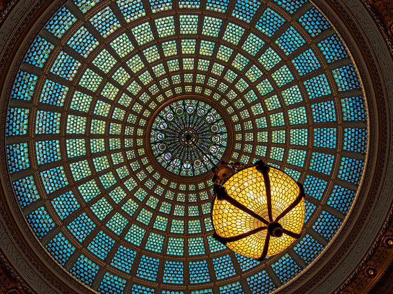
I would love to see the stained glass dome/light photo offered as a TOP print, hint hint. ;-)
[Ctein replies: Greg, thanks very much! The print looks even better-- the JPEG came out kinda "cartoony"-- the blue-greens are too intense and flat.
My next sale isn't scheduled until the end of next year and it doesn't include this (no spoilers, sorry). I don't think there's space in Mike's sale schedule for a single-print sale by me between now and then, but let's see what he says. I'd be agreeable. TOP doesn't want to have too many sales; each should be special.]
Posted by: Chris M | Thursday, 24 September 2015 at 10:20 AM
Thanks for the great review. Is the P600 identical to the P800 except for paper size?
Is there any reason to believe that the P800/600 will be less susceptible to the clogging issues that plague the older Epson printers?
[Ctein replies: Chris, since I have never, ever had head-clogging issues with any Epson printer I have owned (save the 2400 that I stupidly left sitting unused for over half a year, while I was writing Digital Restoration) I can't speak to that. Personally, I don't think Epson printers are "plagued" at all; I think it's Internet sample bias. That is, it's a known failure mode, but that doesn't mean it's common. You can't tell from the number of complaints because you don't know the size of the sample space]
Posted by: Chris | Thursday, 24 September 2015 at 11:22 AM
Do you know of any technical reason that Epson is not "upgrading" the printer-managed color space in Windows to aRGB? Because my household is all Windows, I'm stuck with it. Is Epson ever planning to fix this issue?
[Ctein replies: Greg, as I understand this (from Dave Polaschek), it's not an Epson thing but a Windows thing. The chunk of Windows code that the Epson driver talks to to print only supports sRGB. So, it might get better in future versions of Windows.]
Posted by: Greg Boiarsky | Thursday, 24 September 2015 at 11:58 AM
Ctein
Thanks, it seems like the P800 is a solid advancement and it's time to upgrade my aging 4800 (with Image Print RIP)
Can I assume from your comments that I can safely forgo a RIP with the new machine?
Re Soft Proofing, I have always treated Soft Proofing as 'approximate' as well, but I always assumed it was my hardware issue. (Apple Cinema Displays) Folks who swear by Soft Proofing usually have wide gamut high bit depth displays.
Even the 5k iMac which has incredible resolution but is still limited to sRGB and 8 bits. Sadly Apple still doesn't support 10 bit color.
Re Upgrade Path. Epson has already announced 11 ink Sure Color printers,using new Ultrachrome HDX inks but so far only 24" and above the P7000 & P9000 They also introduced a P6000 and P8000 with a smaller ink set (perhaps the same as the P800??)
So if you want Epson's best ink technology, it appears that there is no longer a 17" option
This is not to say that the P800 isn't wonderful, but I don't buy printers that often so I like to buy the best available technology and keep it a long time. If there was a 17" printer (like the 4900) with their best ink set, that's what I would have bought.
[Ctein replies: Michael, I am hoping someone from Epson will chime in, but seeing as the large format printers were announced only a week ago, assuming that Epson is done "upgrading" their lines seems, well, premature. Reading tea leaves in a cup not yet drunk.
I've never compared any of this to ImagePrint. I have a friend who swears by it. Someday I might do a comparison. Or not.
My dissatisfaction with soft proofing is not a display hardware issue. My iMac display is plenty good enough to see the mismatches that vex me. We can talk about this more when I write the next Profiling column. ]
Posted by: Michael Perini | Thursday, 24 September 2015 at 12:53 PM
Totally OT, and FYI. The Phoenix Public Library has ordered forty-one copies of Saturn Run. I am number one in the holds queue.
Your book is going to pay for a lot of ink!
Posted by: Allan Ostling | Thursday, 24 September 2015 at 01:21 PM
Ctein, Just wondering what colour space you're using in Photoshop. Does the printer software convert the image to AdobeRGB when you specify that for printing. I use Lightroom 5, which uses ProPhoto working space. Does the image source in a larger colour space have any affect on the output, or do you need to convert to AdobeRGB before sending the image to the printer? I have an R2880 and Canson Baryta, so will be trying this out (on a Mac of course).
Wayne
[Ctein replies: Wayne, no you shouldn't mess with your working color space. Most of my work is done in ProPhotoRGB, because that's best for importing from digital cameras - there's less clipping of the extrema.]
Posted by: Wayne | Thursday, 24 September 2015 at 01:52 PM
Thanks for the review. My HP B9180 is still hanging in there with only one printhead replacement since I bought it new, and I'm still happy with mine, but at least now I have the sense that I have someplace to go next and I can throw out its enormous box and reclaim a little space in my storage unit, for now at least. One interesting thing I've discovered, which may apply to other printers, is that its performance has improved (meaning fewer visible artifacts) since moving from New York to Honolulu, presumably thanks to the higher humidity here, so if life brings me back to the mainland, the printer will stay in the islands.
Posted by: David A. Goldfarb | Thursday, 24 September 2015 at 02:10 PM
Clogs are much less an issue with modern Epson versions, it seems, except for the 4900. There are far more complaints online about the 4900 compared to other models, and an 'insider' (in the sales world) confided to me a year or so ago that production was halted for a period in recognition of the concerns.
I'd also like for someone from Epson to chime in....especially concerning any 4900 P version on the horizon....
Posted by: Jeff | Thursday, 24 September 2015 at 02:33 PM
I’d like to come back on Craig’s “pizza wheel marks” question. Did you also look at the SC-P800 prints outdoors in (bright) sun light? I only started noticing those irritating glittering pizza wheel streaks in very dark (and saturated) areas of my SC-P800 prints on glossy paper when I took the prints out on the balcony. The marks are usually not visible inside in a normally (dimly) lit room. Hahnemühle FinaArt Photo Rag Pearl does show the marks even when only dimly lit, though.
When I’m looking at the paper transport mechanism of the SC-P800 I can’t really imagine people not having those pizza wheel marks on glossy paper prints as it seems the sharp pizza wheels inevitably have to break the gloss coating of photo papers if they are doing their job of holding the paper down and in place right.
Btw: Beautiful example images :-)
[Ctein replies: Miles, thanks for the compliments!
No, really, I don't see pizza wheel marks. Maybe you should check your " purity of heart and nobility of spirit" rating in Photoshop. Mine is 8.3. If yours is below 7.0, you might have pizza wheel problems. [vbg]]
Posted by: Miles | Thursday, 24 September 2015 at 03:54 PM
Andrew wrote earlier:
One thing that bugs me about the 3880 is that getting paper properly lined up in the rear - for thicker matte papers - is dicey. I often have to try and try again to get the paper properly inserted.
I used to have this problem as well but I've found that the following technique gives much greater success.
Feed the paper in the back as usual and press down slightly until the printer starts to draw the paper inwards. Then keep the downward pressure on with the tips of your fingers at the top of the paper. You will find that the printer gives a bit of a kick back before continuing with drawing in the paper. Pushing against this kick back definitely increased my successful load score. I think what happens is that the kick back without the finger pressure often causes the paper to shift slightly and that results in the misaligned error message.
Posted by: Len Salem | Thursday, 24 September 2015 at 03:57 PM
PS
If You reprint Jewels of Kilauea, I vote for Competing Ferns.
I have the Dye then I could do my own comparison.
What do you use to Scan those Negs?
[Ctein replies: Michael, a Minolta Dimage Scan Pro Multi. I now own 2.7 of them.]
Posted by: Michael Perini | Thursday, 24 September 2015 at 04:47 PM
Ctein,
Thank you for clarifying the color space issue with Windows. I have a windows computer and wondered why. I can only guess that the web, which uses sRGB, with its massive number of Windows users, makes it not an important upgrade for the MS softwares.
Posted by: Mathew Hargreaves | Thursday, 24 September 2015 at 08:15 PM
For Canon printer users the ImagePROGRAF Pro-1000 17″ printer is about to be released. No real info at this point. Will be interesting to see what it can do - I'm still using a 9 year old iPF5100!
Posted by: Phil Aynsley | Thursday, 24 September 2015 at 10:15 PM
Windows: I can set my R2880 printer to Automatic Mode: let the printer manage color - and there is a choice between sRGB and Adobe RGB. I choose the latter and send the image TIF, prepared in Adobe RGB, to the printer, for example, from within Picture Window Pro. I don't see where Windows intervenes in the choice of color space.
Posted by: Charles | Friday, 25 September 2015 at 11:22 AM
As an owner of Epson 3880 I can attest that pizza wheel marks are very real and only way one will not get them is if one is using front feed path.
If one is using other paper paths they will be there, there is no physical way to avoid them, those pizza wheels _WILL_ touch that paper and no amount of "karma" can change that reality.
They will be most noticeable on non-matte papers in dark areas, one will be able to see them with naked eye if lighting conditions are right and one inspects them carefully enough (and my eyesight is below average).
IMHO only way one will not notice them is if one is giving very cursory look and/or is inspecting under very diffused/poor lighting conditions and/or has very poor eyesight.
[Ctein replies: iXandra, you're new here, aren't you. [s]]
Posted by: iXandra | Friday, 25 September 2015 at 02:31 PM
Ctein, you'll probably like this page, Chicago Cultural Center shot before the restoration of the dome. The dome is believed to be the largest Tiffany glass in the world. Some of these are extremely high resolution 360's shot many years ago. It also shows you another place to visit when in Chicago, the Elk's memorial. It's free and open 7 days a week, even parking is free in the visitor parking lot on the south side.
http://www.robertharshman.com/360vr/vr-7.html
Posted by: Robert Harshman | Friday, 25 September 2015 at 06:00 PM
BTW, here is one reason why _NOT_ to get P800 if you already own perfectly fine 3880: If you are user of non-Epson papers and don't have a way to create your own paper profiles you won't have a profiles for it yet.
[Ctein replies: iX, ... or one can't/won't pay a third party like Andrew to create good custom profiles for you.
But, my experience has been that "canned" profiles, whether from the printer maker or the paper maker, are, on average, not very good. Definitely not in the league of a custom profile. Which is why I didn't even discuss them. Also, again on average, using the printer-maker's nearest-match profile produces about as good results as the paper-maker's supposedly-customized profile.
It's a bit of a disappointing state of affairs. But, for example, if I print on something like Ilford Gold Fiber Silk or Canson Baryta Photographique using Epson's provided profile for a similar paper of theirs, it's not worse than using the profile that Ilford or Canson provides. Either way, not what I'd be recommending to people over a custom profile or over printer-managed color.]
Posted by: iXandra | Friday, 25 September 2015 at 09:40 PM
Regarding "Printer Manages Color" in Windows. This was discussed at some length in the previous ToP thread on CM. Since then, on Lula there was a discussion in which several people tested setting the printing space to be the same as the image space in Photoshop on Windows.
So if your image is in ProPhotoRGB for example, set the printer space to be ProPhotoRGB as well, together with Photoshop manages colors. Photoshop will show a great big warning, but you can ignore it. Those tests reported on Lula clearly showed that this effectively turned CM, as "Printer Manages Colors" once used to. Whether this null profile conversion trick works on Mac as well, I have no idea, but I suspect not.
The other option in Windows is to print from Qimage, which unlike Photoshop, does have a proper color management off option.
That said, I'll be using a custom profile for most color printing.
[Ctein replies: Ferdinand, thanks for that report. OK, so there may be ways to get out of sRGB space when printing under Windows. Charles made that observation earlier in the comments, too. So noted.]
Posted by: Ferdinand Sayn | Sunday, 27 September 2015 at 08:47 AM
I'm a little confused, are you saying just let the printer manage color and don't look back?
[Ctein replies: Steve, always look back. 'Cause things change. And you may hit a weird and rare corner case. But, if you're running in the environment I describe, yeah, just let the printer do it.]
Posted by: Steve | Sunday, 27 September 2015 at 11:43 AM
Do you know anything about "hacking" the P800 or P600? I have an R2400 that needs to be replaced, and have been using 3rd party inks with success. I also removed the waste ink lines so instead of going into the "diaper" below the printer, waste ink goes into a bottle. Do you know if either is possible for the new printers?
I am nervous as well about pizza wheels. After my experiences with the 2400, I have at times sworn I won't buy another printer without a vacuum feed.
Posted by: Matt Haber | Sunday, 27 September 2015 at 06:02 PM
There is one additional benefit concerning the new Epson P800 that you did not mention yet: The manual controls are on the front of the printer, not on the top as they are on the Epson 3880. Why does it matter?
It matters because my cat likes to sleep on top of the printer. He inadvertently hits the controls, the printer changes settings, initiates cleaning cycles and such. Well, the cat enjoys the humming noise as well as the gentle vibration of the printer and started hitting the controls on purpose: A case of animal/ machine misunderstanding - much to my disadvantage. The new model takes care of this issue.
Posted by: Angela Weil | Tuesday, 29 September 2015 at 04:43 PM
Looks like Epson is introducing some new 24" and 44" printers:
http://www.dpreview.com/articles/3130524299/epson-introduces-quartet-of-surecolor-large-format-printers
P.S. Oh snap! I didn't read thoroughly enough. You already announced this. My bad (hope this doesn't sink me into pizzawheel purgatory)
[Ctein replies: Ned, well I certainly hope not! One's karmic fate shouldn't be dependent on an errant web post. That would simply be too unjust.]
Posted by: Ned W | Wednesday, 30 September 2015 at 02:32 PM